Designing the new USAspending.gov
Posted on: May 31, 2016 | Tags: design,user-centereddesign,testingGreetings federal spending enthusiasts! While our software development team is full steam ahead on building out the DATA Act Broker (which ingests federal spending data into the system), our design team is working hard on new concepts for the future USAspending.gov.
Designing the new USAspending.gov is challenging. The site will need to cater to vastly different audiences, from the average citizen to the budget wonk. It must meet the needs of the current users, but not be constrained by what exists already. And it must make complex data findable and usable.
But does it sound like we’re complaining? We love a challenge!
In this post, we want to share a little about our process for meeting the challenge of making spending data available and accessible to everyone.
Step 1: Finding the Questions
Our first step in designing a website is not to find the answers, but rather to find the questions.
We have scoured the suggestions from our Town Hall meetings, notes from workshops with federal agencies, analytics, and feedback on the existing usaspending.gov. We want to learn what you want to learn from USAspending.
Some questions we’ve found were (these are just a few of the hundreds):
- Who is receiving money in my state, county, city?
- How are funds being used to address national, state, and local needs?
- Which federal funding comes into my state, and which state agencies receive it?
- What is the geographic breakdown of federal spending?
We grouped these questions into major themes, keeping track of how many questions were in each theme. We picked the most popular themes to design for first.
Step 2: Sketching
Next we held a “design studio.” A design studio is a sketching session where designers and stakeholders work together to brainstorm and draw solutions to a defined challenge. For us, participants get markers and a spot on a whiteboard to sketch concepts that will answer those predefined questions.
Our sessions have included folks with deep knowledge of federal spending data and those without. Some had artistic abilities and others had, well, a deep knowledge of federal spending data.
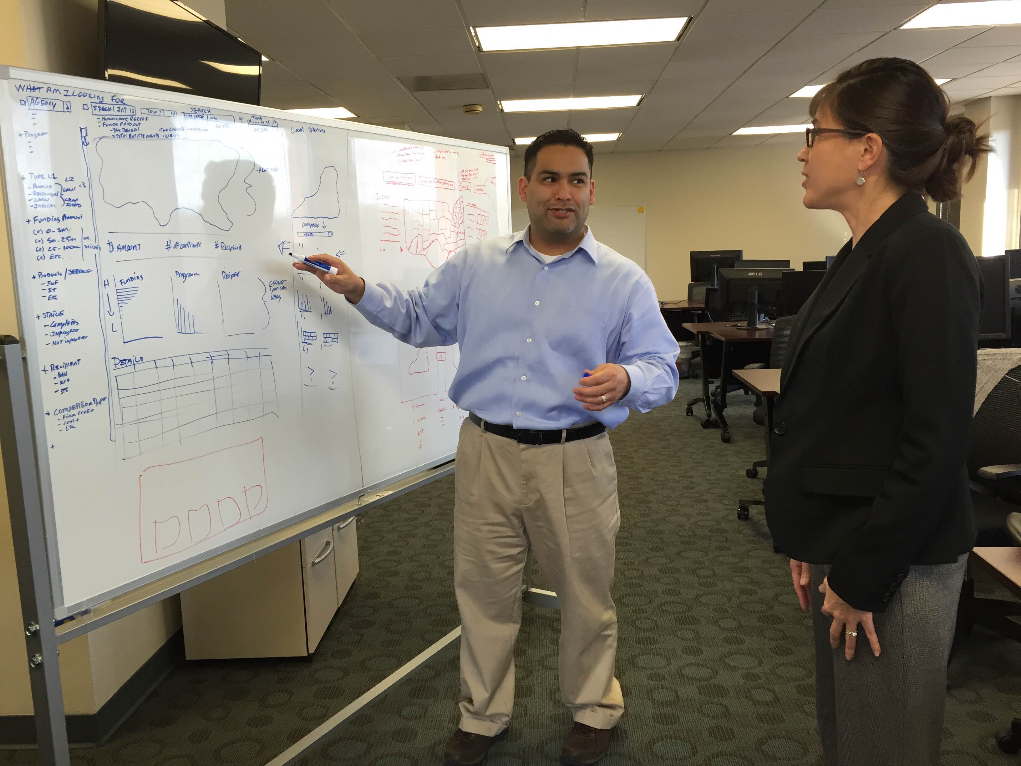
After sketching individually, each person then explained their concept to the group and made adjustments and improvements based on feedback.
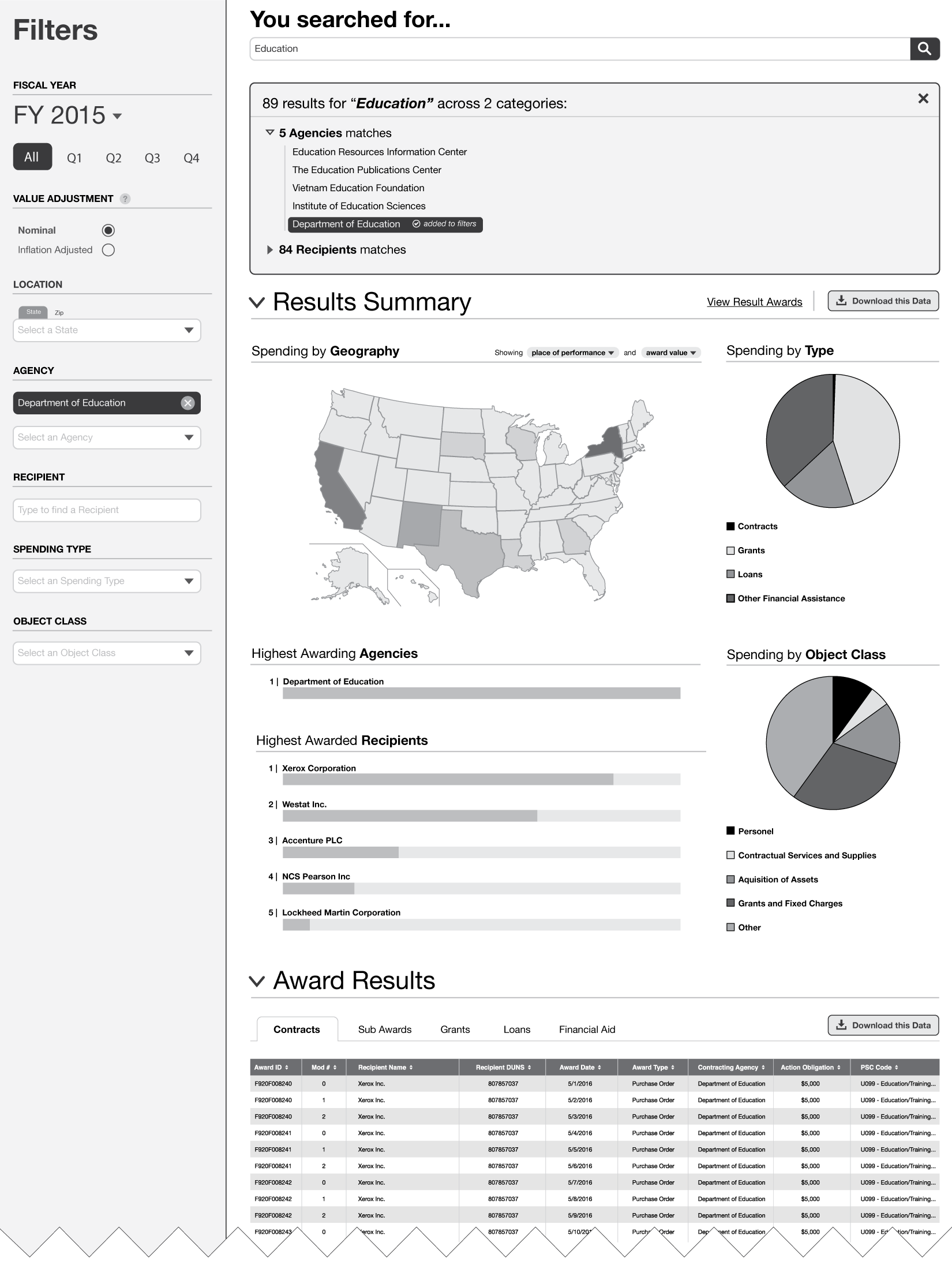
Step 3: Wireframing
With multiple designs and ideas in hand, we took the best elements and put them into wireframes. Wireframes are like blueprints of a webpage (or mobile screen) that show the layout and primary elements, but lack color and visual design.
Wireframes are GREAT tools for testing out designs because they take only minutes or hours to create instead of the days or weeks it would take to code a real webpage.
Step 4: Testing and Iteration
Our next step involves you!
We show our wireframes to users and solicit comments and feedback. After garnering valuable feedback, we iterate on the design and carry out repeated test cycles to incorporate suggestions and quickly deliver improvements.
Step 5: Mock-ups and Build
Once we feel that we’ve received sufficient feedback on the wireframes, we’ll develop mock-ups of the page: refining the design, adding color and fonts, etc., and hand them off to developers to build out. Testing will continue on the real pages to make sure they are working as intended.
It all depends on you
The bottom line is that we can only get it right if you participate in the process. Visit the new USAspending.gov to see the new site design, and tell us what you think! If you want to schedule an in-person testing session, please contact us.